BRANDING A PREMIUM SALON WITH ART DECO ELEGANCE
Voorpret is a beauty salon dedicated to providing a non-toxic, tranquil experience, ensuring you feel at ease in expert hands. Your health and safety are their top priority, using only allergen-free, non-toxic color lines that are gentle on your skin and hair for a soothing experience every visit. Seeking an Art Deco-inspired design with a blend of black, gold, and a hint of light pink, Voorpret turned to Iron Method. The result? A sophisticated, premium aesthetic that stands out in the health and beauty industry.
WEB DESIGN
We crafted a top-tier brand identity for Voorpret complimented with a premium website. See it for yourself at www.voorpretbeauty.com
PACKAGE DESIGN
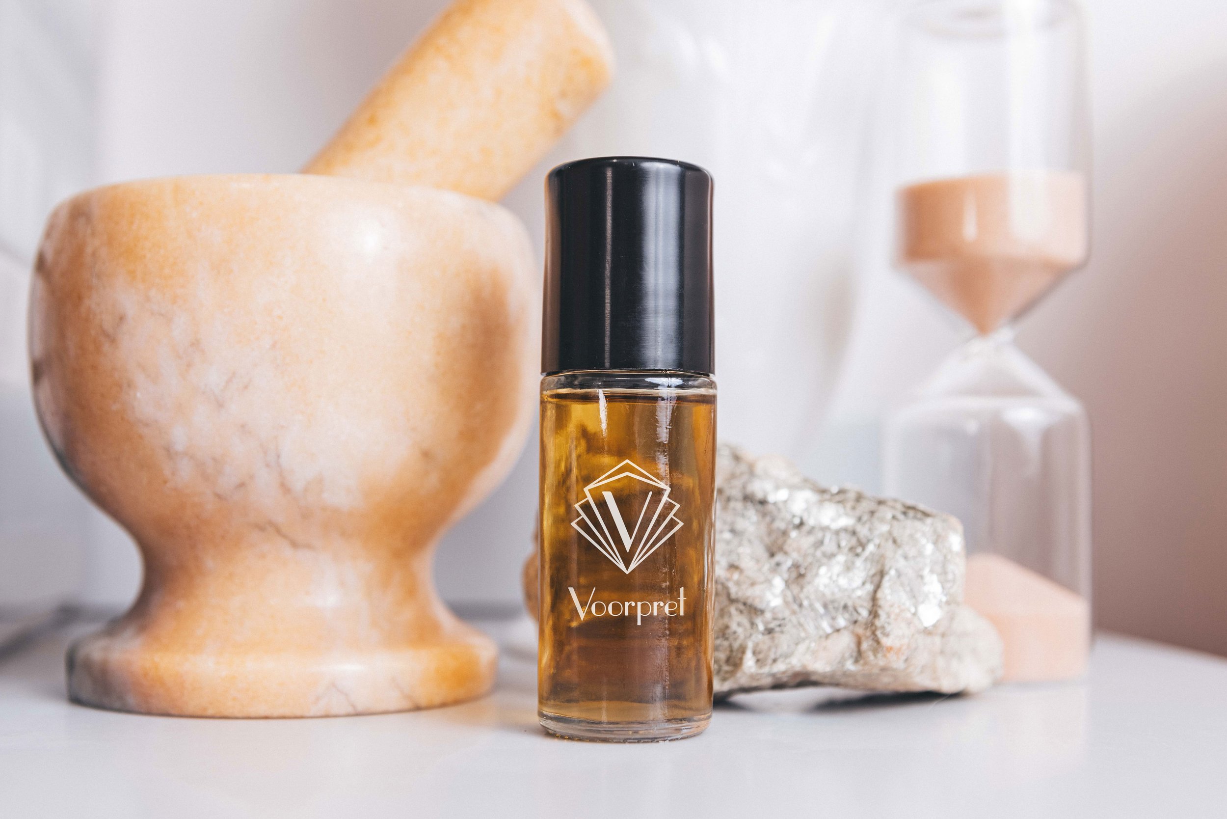
Voorpret crafts small-batch, premium beauty products with organic, non-toxic ingredients, including lavender essential oil from the lush fields of Provence, France. To elevate their branding, we designed a sophisticated, versatile and universal label that embodies luxury and elegance that can be used across multiple products.


PHOTOGRAPHY
We visited Voorpret during off-hours to connect with Andrea and immerse ourselves in her serene space. To capture its essence, we brought a digital camera and documented the beauty of her tranquil environment. Next, we’ll be bringing in models to showcase the master stylist’s expertise through engaging service photography.
Additionally, we traveled with Andrea to France to visit the breathtaking lavender fields where some of her essential oils are sourced. The scenery was stunning, and the fragrances were truly unforgettable.


